Tuesday, July 5, 2011

Glossy emblem text effect


In this tutorial, we’ll demonstrate how to create the following nice looking Glossy Emblem Text Effect with Adobe Photoshop in 4 simple steps.
glossyemblem final Glossy Emblem Text Effects with Photoshop
With just one text layer and a few layer styles you can have yourself a deliciously glossy emblem text effect in no time. Since the entire effect is done on a vector text layer, you’ll be free to change the font face or letters to suit your needs and still retain all of its styling. As a final touch, we’ll add a simple shadow to give it some perspective and realism.

Step 1

Fire up Photoshop and set your canvas to 800×600. We’ll be using a dark perforated material for the background. This can easily be made by cutting out a pattern of circles from your background and applying a subtle bevel. Feel free to grab the background from the PSD file or use another texture if you wish.
glossyemblem 01 Glossy Emblem Text Effects with Photoshop

Step 2

Next, lay out your type. I’m using black Trajan, 425px in size to cover most of our area. A couple of letters will do for now.
glossyemblem 02 Glossy Emblem Text Effects with Photoshop

Step 3

Now lets slap on a barrage of layer effects. Start off by selecting your text and going to Layer > Layer Style > Drop Shadow and enter in the settings below. Then continue down the list while paying close attention to each setting and blending mode. Also take note of the different contour maps being used. You can find a larger array of contour maps.
glossyemblem 03 Glossy Emblem Text Effects with Photoshop
glossyemblem 04 Glossy Emblem Text Effects with Photoshop
glossyemblem 05 Glossy Emblem Text Effects with Photoshop
glossyemblem 06 Glossy Emblem Text Effects with Photoshop
glossyemblem 07 Glossy Emblem Text Effects with Photoshop
glossyemblem 08 Glossy Emblem Text Effects with Photoshop
A closer look at the color ramp for your Gradient Overlay:
glossyemblem 09 Glossy Emblem Text Effects with Photoshop
glossyemblem 10 Glossy Emblem Text Effects with Photoshop
And here’s what your stroke’s gradient should look like:
glossyemblem 11 Glossy Emblem Text Effects with Photoshop
glossyemblem 12 Glossy Emblem Text Effects with Photoshop
You should now have a beautifully reflective emblem with metal trim. But lets add that last shadow for a little depth.

Step 4

Ctrl (Command for Mac) + click on your text layer’s thumbnail (the white box with the capital ‘T’) in the layer’s palette to select it. Now create a new layer underneath your styled text by pressing Ctrl + Shift + N. Fill this selection with black and Ctrl (Command for Mac) + D to deselect. Apply a Motion Blur filter with a -85 degree angle and 39px of distance. Finally, nudge this layer down a tad so most of the shadow falls below your type.
glossyemblem final Glossy Emblem Text Effects with Photoshop
Congratulations, you’ve created a slick type effect in minutes that’ll compliment your next project and maybe even garner praise from your boss, friends or peers.

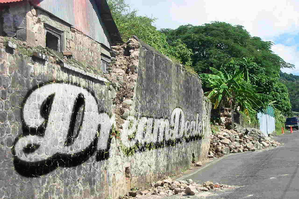
Text Graffti

Step 1 
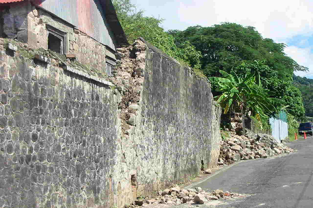
Find yourself a nice photo of a wall to put your logo on (i found this image on the internet with Google Images). Every image is suitable if there is a suitable structure (no smooth walls!).

http://img.dreamdealer.nl/dd/graffiti/stap1.jpg

Step 2 
Place the logo you want to use in a new layer. The logo has to be a pixel-based image (no fonts, paths and shapes) because in the next step we will apply a "perspective transfer" wich requires the layer to be pixel-based.

http://img.dreamdealer.nl/dd/graffiti/stap2.jpg

Step 3 
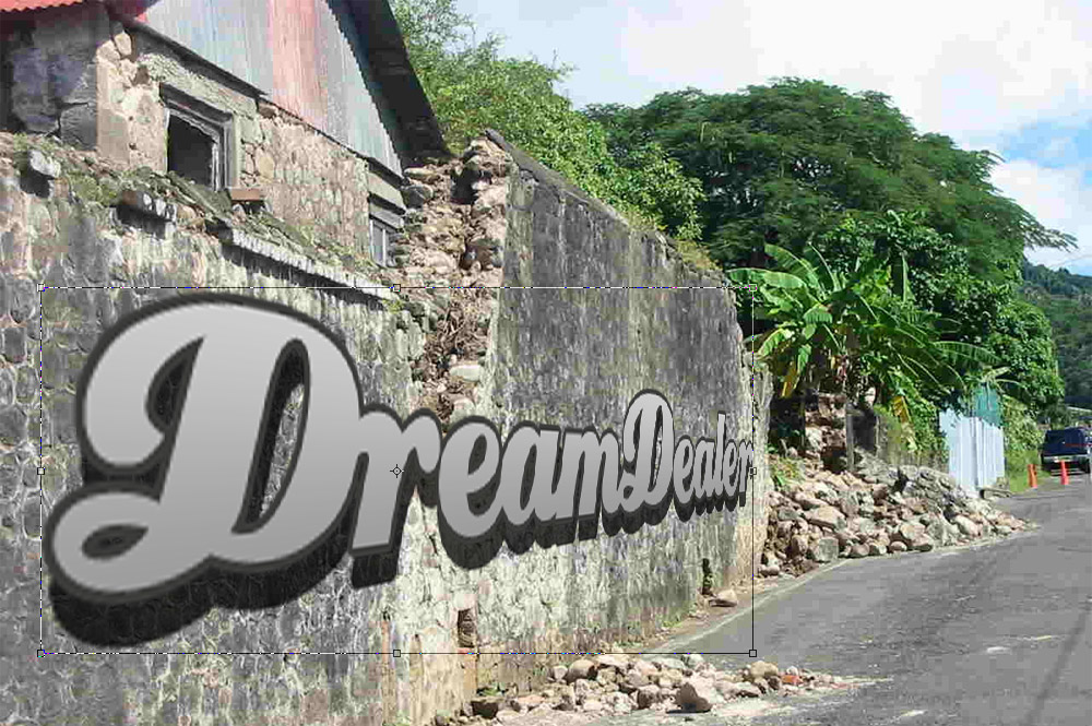
Select "perspective transform" in the edit-menu en change the aspects of the logo that it fits the perspective of the wall. When you mak a "perspective transform" the selection you're transforming gets a bounbing box. You can use the lines of this bounding box to align the logo with the wall.

http://img.dreamdealer.nl/dd/graffiti/stap3.jpg

Step 4 
The logo was just a bit to wide, but thats no problem. You can adjust this with the normal transform tool (CTRL+T). Make it a bit smaller so it will fit nicely in the wall. If the perspective of the logo doesn't look realistic, redo the previous steps, because the realism of this is the most important.

http://img.dreamdealer.nl/dd/graffiti/stap4.jpg

Step 5 
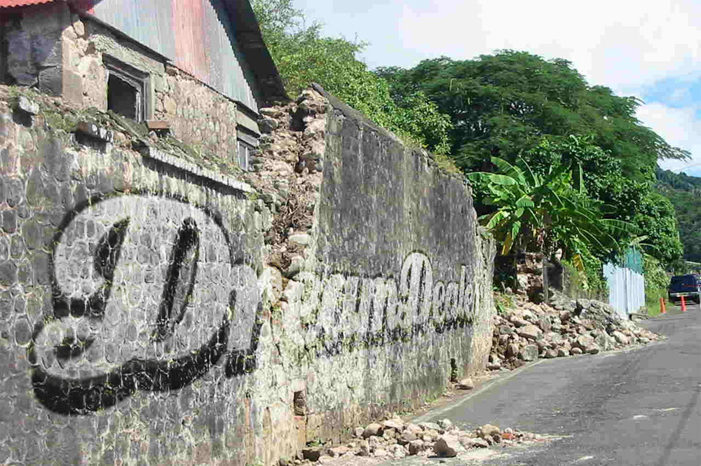
After this, put the blending mode of the logo layer to "overlay":


The result:
http://img.dreamdealer.nl/dd/graffiti/stap6.jpg

Step 6 
The logo still has sharp edges and looks more like a sticker than a graffiti drawing. To make this a bit more realistic we are going to blur the edges a bit. To blur only the edges, but not the logo, you'll have to make a copy of the layer and place it under te original logo.


Step 7 
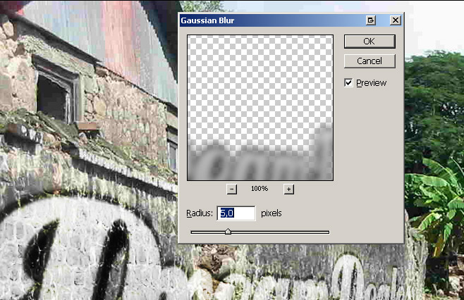
The, blur the copied layer with a "Gaussian Blur" with a value of 5,0 pixels. The gaussian blur is found in the filter-menu.
http://img.dreamdealer.nl/dd/graffiti/stap8.jpg

Step 8 
At last, to improve the realism, use the eraser tool to erase the logo where the wall is worn down.

http://img.dreamdealer.nl/dd/graffiti/stap9.jpg

Verfijnen 
If you like the vague version of step 5 more, but with the blurred edges, you can select the blurred layer and click (while holding CTRL) on the thumbnail of the original logo layer. This way you'll select the outlines of the original layer. If you've done this, press DELETE to delete the selected part from the blurred layer.

To make it all even more realistic, you can place another graffiti (a more worn down one) on the wall of erase more from the logo to make it look more worn down.

From dreamdealer

Wednesday, April 27, 2011

Dirty Grunge Typography Piece


  1. Make a new document that is 757 (width) x 510 (height). Fill your document with the background color #0bd08d.
  2. Now to begin this piece, I will be using the typeface ‘Univers’ and it’s many forms. If you don’t have this typeface, don’t worry. There are many other alternatives that are just as good. I would recommend using Arial if you don’t have Univers. We’re going to begin by writing out “You know that if I could I would stop the world”. Of course before we begin we must think about how we will assemble the text. Typography pieces are construction to me. I group words based on their importance (which will be larger in hierarchy, which words are most important, which will be bold, etc.) and then I arrange them accordingly. Also, use white and black as your colors and alternate them as pictured. Or whatever you like best!
  3. One important thing I relate to typography is alignment. Things should line up properly. Things should look clean and together. I usually eyeball things but since we want to be precise here we’ll break out the rulers (CTRL+R) and line up some things to make sure everything is in order. Just drag the rulers down and see if things line up. Things don’t always have to be aligned (say if you’re doing an intentionally non-gridded piece) but for this piece they will be.
  4. Now that we’ve gotten everything aligned we can begin the designing stage. I’m going to begin to add blocks behind the text so they look more dynamic. Make sure you make a new raster for every block. This is a trial and error stage so using the colors black and #e2ee15 (this will be our secondary color) take the rectangle tool (step 1 in picture), make a new raster layer and fill it underneath the text (step 2 in picture).

    I then added another background to the words “YOU KNOW” (color #e2ee15).
  5. For the words “I WOULD” I added a black background underneath, then I changed the type color of the words to the color same as the background.
  6. Change the type color for “THE WORLD” to #e2ee15.
  7. Now we’ll begin adding in the brushes to give it that grunge type look. To do this we will merge all our text layers together so they can become raster layers, and we can edit them. In doing this we can no longer edit the text (the colors, sizing, etc.). So click and shift select all of your text layers then press CTRL+E.

  8. Select your eraser tool, and then select the “YOU KNOW” layer. Now, using a textured eraser like the one below, give the block some texture. You can get the brushes I’m using from my brush set collection on the site. The one I am using is from the set “Magazine Cut Out Scan Brushes” located here.

  9. Now still using your eraser, select some dust and speckled brushes. You can also get these from my site, they’re called “Dirt Speck Brushes” and “Dirt and Grunge Brushes” located hereGo to your newly merged text layer and begin going over the text with the dust brush AS AN ERASER. You should see texture immediately!
  10. Now we can go ahead and do this eraser technique to the rest of our text. As well as adding textures with certain brushes using the eraser tool.


  11. Once you’re satisfied with the texture that your text has taken, switch layers to your text block and do the exact same thing with the eraser tool.

  12. Now go to the top of your layers and make a new raster layer. Grab your brush tool, and selecting the dust brushes once more in the colors black and white.
  13. Add random brushes you find interesting, I’m using lots of scribbles and grunge type brushes. Again, you can find all these brushes in my brush section of the site. The brushes I’m using specifically in this step are from the brush pack titled “Street Grunge Dirt Brushes” located here.


    Added a splatter.
  14. I didn’t like how straight the blocks were (the one under I WOULD) so I went back and erased the top and bottom parts of it to give it some texture.
  15. Add some floral brushes to the piece with the same colors used in your blocks. Make sure you make a new raster layer for these as well, and you place the raster layer underneath the color blocks.

  16. After you’re finished take these swirl brushes (titled “Illustrator Spiral Brushes” in the brush section) and add them on their own raster layer on the very bottom of all these layers. This raster layer will be right on top of the background. This is just to make sure they’re under everything!

    Of course afterwards we will erase with a texured dust brush, so you know what to do!
  17. Voila, we are all done here. You can add some more of your own touches but for now, we have our own grunge text piece. 
  18. the original site click here